
Graphic communication · purpose, hierarchy and persuasion
An advertisement asks an audience to notice an offer and consider a response. It may use photography, illustration, typography, motion or a combination of them. Advertising is therefore a purpose-driven design practice, not one art style. The strongest question is not “Does this look like an advert?” but “What does this particular image help somebody understand?”
A visual introduction
Open any image to look closer, then browse the examples.
Creative toolbox · take this style further
Choose an input, adjust it, then open a tool. Search links pass your text to the destination. Copy & open copies it for you to paste into the generator; you start generation there.
ChatGPT
Copy your input and paste it into a ChatGPT conversation or image request.
Copy & open ChatGPT (new tab)Claude · Anthropic
Develop an image prompt or explore the style in a new Claude conversation.
Copy & open Claude · Anthropic (new tab)Midjourney
Paste your input into the Imagine bar on the Create page.
Copy & open Midjourney (new tab)Adobe Firefly
Copy your input, open Firefly, and paste it into the prompt field.
Copy & open Adobe Firefly (new tab)Leonardo.Ai
Copy your input, open Leonardo, and paste it into the generation field.
Copy & open Leonardo.Ai (new tab)Lexica
Search AI images and prompts using your selected input.
Search with this input Lexica (new tab)Pexels
Search the photo and video library. Short keywords often work best.
Search with this input Pexels (new tab)Pixabay
Search photos, illustrations and other images.
Search with this input Pixabay (new tab)Unsplash
Search photographs using the style name or your own keywords.
Search with this input Unsplash (new tab)Wikipedia
Search for background reading. A style may not have its own article.
Search with this input Wikipedia (new tab)WikiArt
Copy your input into WikiArt’s search to explore artists and artworks.
Copy & open WikiArt (new tab)Instagram hashtags
Search a hashtag made from your input: spaces and punctuation are removed. Instagram may require sign-in.
Search with this input Instagram hashtags (new tab)A closer look
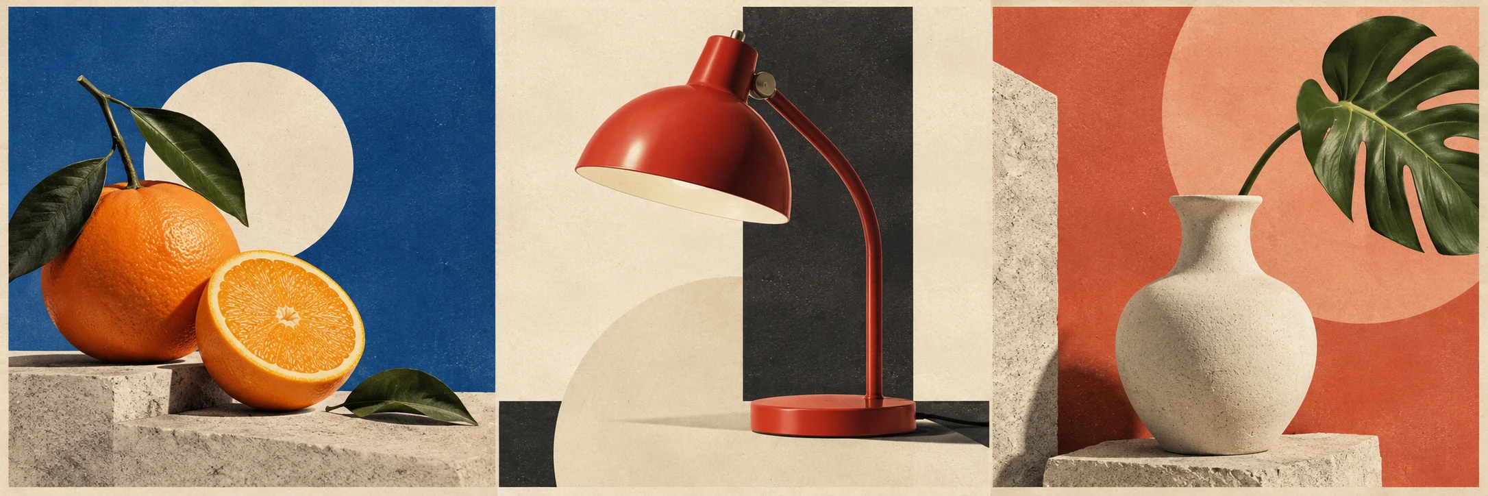
The new banner is an original collage of fictional print-advertising studies: a citrus still life, a graphic lamp and a simple vessel arranged with strong shapes and open space. It contains no real brand, product claim or finished campaign. The variation demonstrates possible visual approaches rather than a historical sequence.
Start with the offer, not the decoration
Write one sentence identifying the audience, the useful proposition and the intended next step. If that sentence contains three competing offers, resolve the brief before producing more layouts. Visual polish cannot decide what the communication is for.
An image can demonstrate a feature, suggest an atmosphere, make a comparison or create a memorable association. These are different jobs. A close photograph of a fastening explains construction; a person relaxing beside a bag suggests a way of life. Choose deliberately rather than treating every attractive picture as interchangeable.
Keep a distinction between an observable feature and an unsupported promise. A fictional mock-up should not acquire invented customer endorsements, performance figures or credentials just because those devices make it resemble a finished campaign.
Historical examples show a range of solutions
The V&A’s poster collection includes Henri de Toulouse-Lautrec’s Jane Avril au Jardin de Paris (1893) and Michael English’s poster for the UFO Club (1967). Their different visual languages demonstrate why advertising cannot be reduced to bright colours and bold lettering. Each belongs to a particular cultural and commercial setting. [1]
Cooper Hewitt’s account of E. McKnight Kauffer’s 1947 work for the New York Subways Advertising Company examines modernist form and symbolic imagery. It provides a documented example of an advertisement making an argument through a designed image, not simply displaying a product. [2]
Use collection records to retain the designer, date, medium and purpose of a reference. Admiring a poster’s colour does not establish that the same approach will suit another audience or format. Historical study becomes more useful when you identify what problem the design was solving.
Make the reading order visible
At a glance, the viewer should have a reasonable starting point. That could be a product, a face, a phrase or a surprising shape. A second level can clarify the proposition; smaller information can support the decision. Hierarchy is an arrangement of attention, not a competition to make every element louder.
In the banner, the isolated objects and strong colour fields establish separate visual propositions. The empty areas are working space: a designer could use them for carefully composed language. They are not instructions to fill every gap.
Test a layout at the size at which it will actually be seen. A poster across a room and a small screen card impose different reading conditions. If a crucial distinction disappears when reduced, simplify the design or give that information a clearer position.
Let words and images do different jobs
A headline need not repeat the object’s name if the object is already unmistakable. It can supply the reason to care, while the image makes that reason concrete. Conversely, an ambiguous image may need language that anchors it rather than another layer of mystery.
A useful first draft uses one principal image, one short proposition and one next step. Add secondary elements only when they answer a real question. A collection of badges, arrows and claims can create the appearance of urgency while making the offer harder to grasp.
For AI-assisted concepts, generate the visual material and review the final wording separately in an editable layout. Check product geometry, accidental logos, misleading implied features and every line of text. The concept image is a starting point for design, not proof that a campaign is ready.
Try one offer in three voices
Invent a modest object, such as a repairable desk lamp. Make one version that explains its construction, one that presents a quiet evening scene and one that uses a spare graphic metaphor. Keep the underlying offer unchanged.
Compare what each version makes clear and what it merely suggests. A good advertisement can be witty, restrained or exuberant. Its visual character earns its place by helping the offer become intelligible.
A small poetic detour
Original words from the AOI studio.
Poetry
A lamp enters the page.
The empty space beside it
waits for a reason.
The prompt workshop
Original creative exercises. These prompts create new illustrations, not documentary evidence.
Start with one object
Create an original advertising concept image of a simple unbranded desk lamp on a quiet coloured ground. Strong silhouette, useful negative space and coherent lighting. No claims, logos or generated text.
Original AOI exercise; a generated image is not historical or documentary evidence.
Build three approaches
Develop three original visual concepts for the same fictional repairable lamp: construction detail, evening atmosphere and graphic metaphor. Keep the object consistent and explain the different communicative jobs.
Original AOI exercise; a generated image is not historical or documentary evidence.
Test the hierarchy
Reduce the concept to a small thumbnail. Keep one focal object and remove competing decoration. Reserve clear space for a separately typeset proposition and next step.
Original AOI exercise; a generated image is not historical or documentary evidence.
People & works to explore
References discussed in this article. Consult the sources below for context.
Artists and practitioners
Henri de Toulouse-Lautrec — poster example in the V&A collection
Michael English — UFO Club poster example
E. McKnight Kauffer — modernist advertising design
Paintings and other works
Jane Avril au Jardin de Paris (1893)
UFO Club poster by Michael English (1967)
Kauffer’s New York Subways Advertising Company posters (1947)